Customization Guide
Responsive Tables
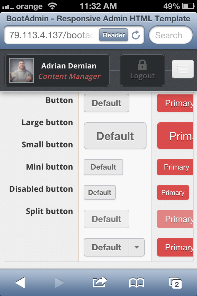
This theme supports responsive large data tables with many columns that fit perfectly to any device screen. This documentation uses responsive tables, so to see it in action go ahead and resize you browser window and check the Buttons section bellow, under Navigation.
There are many different methods to achieve responsive tables in the wild, but we picked the top two most finest techniques to date that make a great UX for this purpose. Your mobile users will love these.
Regular Non-Responsive Table on mobile device screen

This figure describes the problem: We have a big table that doesn't fit on device screen.
Method one: Horizontal Swipe Table (originally Flip Scroll)

This technique was first published by David Bushell and it features horizontal scrolling. A sample usage context could be a comparison table.
Method two: Block Table (originally No More Tables)

This technique was first published by Chris Coyier. This time there is no horizontal scroll, instead it forces tables to act differently.
Using Responsive Tables
<!-- Method one: Horizontal Swiping -->
<table class="table table-responsive swipe-horizontal">

<!-- Method two: Block -->

Note: 	This method makes use of HTML5 data-* attribute, in our case data-title
	and it must be set on each table's column, the <td> element;
	This is perfectly valid HTML5;

<table class="table table-responsive block">
	<thead> ... </thead>
	<tbody>
		<tr>
			<td data-title="Heading #1">Column #1</td>
			<td data-title="Heading #2">Column #2</td>
			...
		</tr>
	</tbody>
</table>